Showing posts with label BA4 Project 2. Show all posts

Sunday, 27 November 2011

BA Unit 4: Concept Visualisation

Sarah Fletcher

101685

http://studiomao.blogspot.com/search/label/BA4%20Project%202

Final Environment Concept


I decided to change the framing of my picture and making it a landscape instead of portraite orientation. I wanted to reduce the amount of free space surrounding the focus points.

Tuesday, 22 November 2011

Reflection

Because my version of Zork involves a player determined character design, I was at a lost with how to go about doing the task of project 3.
I see the environment of this game as more of a character than the playable character and so sought to have the environment as the focus for my concept art while barely looking at the character design.
However, looking back over notes for project 3 and understanding of coherent worlds, I realise that while it is still somewhat true that the environment is a strong character in my game, my understanding of what the environment is was not completely accurate.
I realise now that I could included art work of animals as a focus of the concept work, instead of just having them as a small element.

Monday, 21 November 2011

Composition

Rule of Thirds


The Rule of Thirds work in 2 ways.
Using the rule of thirds, an image is split up into 9 even segments. Along the lines and near where lines meet, at 4 points, is where the focus of the picture should be.
Also, a part of the picture (be it the focus or not) should take up 2rds of the image, leaving a 3rd of the image either quiet or where the focus is.
My photograph of an asian Ball Jointed Doll demonstrates both of these rules. The figure of the doll takes up 2 thirds of the image and the out of focus background fills the remaining 3rd. This Brings the doll to the viewers attention and although they're not on the point exactly, the hand and face are on the lines and are situated almost evenly from the point, putting them both in focus.


Iconic: The iconic guides, in a sense, frame the image. Within the center of the diamond if the focus of the image and on the outside of the lines is the background and the features that are supposed to be surrounding it.
Cross: The cross guide essentially gives a sense of balence. No matter where the cross is placed within the picture, at the points where the lines cross is where the focus will be as well as the point at which the colours balance out.
The above illustration is an example of both practices. Both the girl and the beast are situated within the diamond while the background changes from dark with highlights to light with shadows at the stoppng line of the cross.


Devine Proportions rectangle


Devine proportions spilt a rectangle up into squares, contuing around the space until the smallest point is reached. This forms a spiral around the page which leads to the focus. The smallest point is, according the devine proportion, where the focus of the image should be. The above picture is a very good example of this, strting off with the trail of lotus that fall exactly on the path of the spiral until it meets the two figures, situtated right atop the point of focus.

Sunday, 20 November 2011

Assets and Inital Concept

As part of making up the environment, I created some assets.


The Z.O.R.K Statue after rubble has fallen on it and damaged it. Moss and grass has begun to grow on it.

Image Sourced from Plastic Kits


A damaged car. Once again moss and grass has taken over it and the body rusted.


I've decided on using the 2nd to last thumbnail that I worked on, with the building falling into another. In a way giving sense as to why some buildings are still standing even though theres been a lot of earthquakes and what not. I've gone for a portraite orientation to give a sense of how massive these buildings are.

Saturday, 19 November 2011

Environment Thumbnails

Using the silhouettes, I complied a number of thumbnails for possible concept pieces.
I particularily like the top row; 3rd and 4th ones, 2nd row; 3rd one and all of the bottom row.

I feel the bottom row and row 1, 3rd thumbnail illustrate the environment the most with the mix of a lot of foliage in weird places and the amount of damage to the buildings, cars and what not.

Reference and Inspiration

http://fav.me/d1gz9qc

http://uk-visit.co.uk/wp-content/uploads/2010/12/Exmoor-%C2%A9-IDS.photos-flickr.com_.jpg

http://surrealeye.deviantart.com/art/Emotions-in-Echo-48748256

http://www.howdoiselfbuild.com/blog/old-and-abandoned-houses

http://craphound.com/images/tokyo_genso_2.jpg

http://upload.wikimedia.org/wikipedia/commons/7/70/Abandoned_building_overgrown_with_ivy_Paramaribo.JPG


http://vsifoto.com.ua/halereia/files/20110822222429.jpg

http://d24w6bsrhbeh9d.cloudfront.net/photo/640241_700b.jpg

http://s0.geograph.org.uk/photos/49/94/499433_b86896a7.jpg

http://abandonedkansai.files.wordpress.com/2011/07/an-overgrown-apartment-building.jpg

Thursday, 17 November 2011

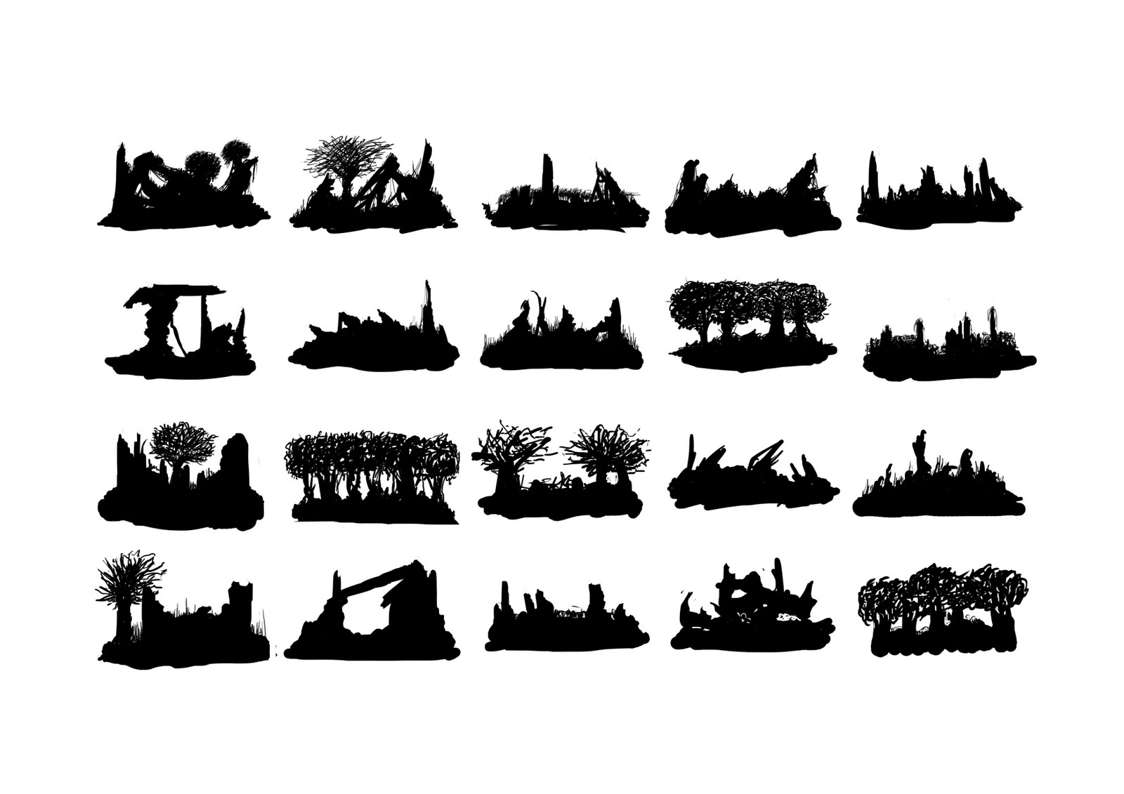
Silhouettes


At first I felt frustrated with the idea of creating silhouettes for this project as I didn't really feel like I was getting my idea across through the silhouettes and wanted to go straight through to the thumbnailing stage. However, as I progressed through this process, I discovered that I enjoyed it and realised the potential they had for me. As we can see in the last set of silhouettes, I started to get a better idea of filling in the canvas, framing and view points to consider.

I've chosen to do silhouettes of the environment and some of the assets which will make up the world because in ZORK: The Remnants, although there are characters, the main character is player defined. The player does have a chance to encounter other survivours in the main game but they could also miss out on meeting them or chose not to involve themselves with him or her. It's the environment which the player will be interacting with the most and sets the game appart from other survival games.